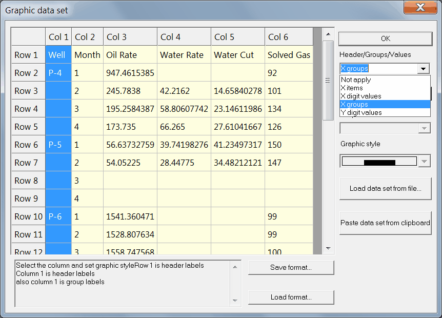
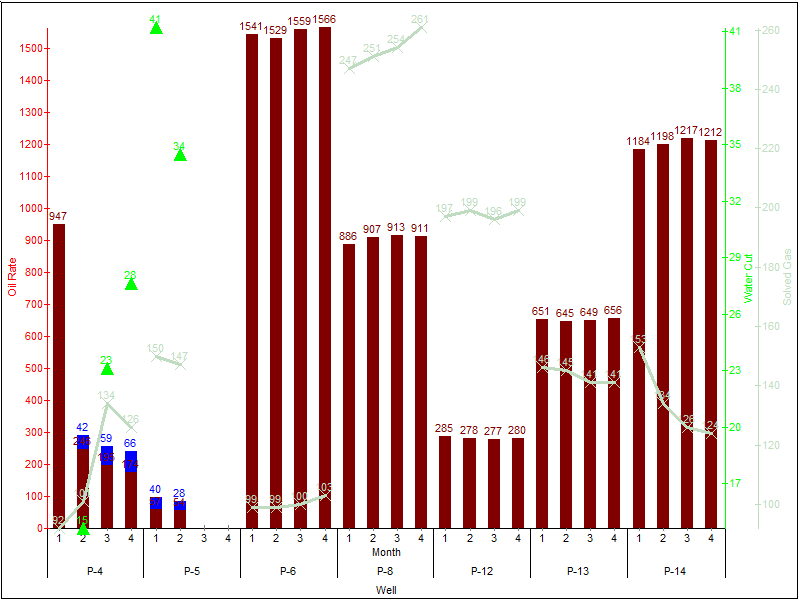
Graphic plots with a few Y-axis
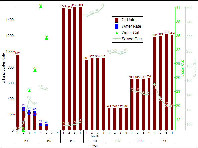
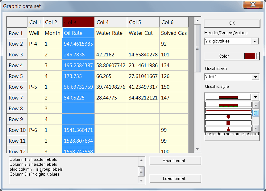
1. Choose the File | New graphic plot menu command.
2. Click the Paste data from clipboard button to copy the data set from Excel, for example.
3. Click on Row 1 and set it as the header
4. Click on Col 1 and set it as X groups
5. Click on Col 2 and set it as X items
6. Click on Col 3 and set it as Y digit values. Define the color, the axe and the graphic style.
The graphic styles:
is bar;
is adjacent bar;
the other styles are lines, point symbols and symbols on line.
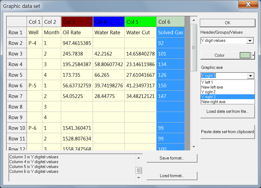
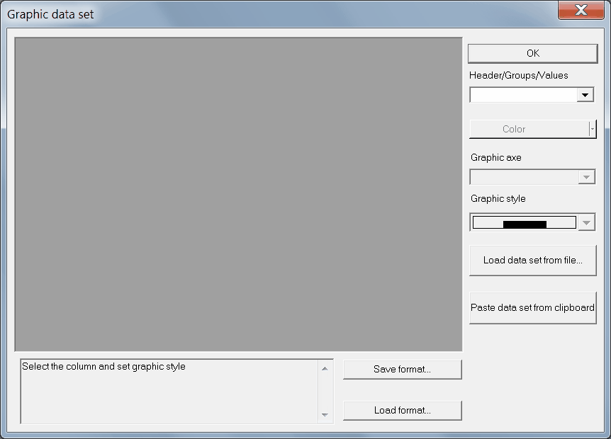
8. You can save plot format to use it for other data set at next time. Click OK
9. Double-click on the axis, the legend, the graphic field to edit them.